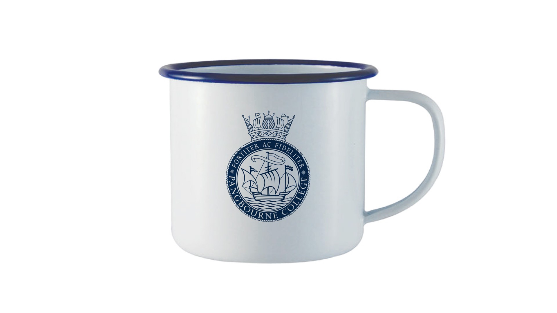
A brand refresh reflecting traditional values
"Thank you for all your assistance with this project, everyone thinks the branding looks fabulous."
Brief
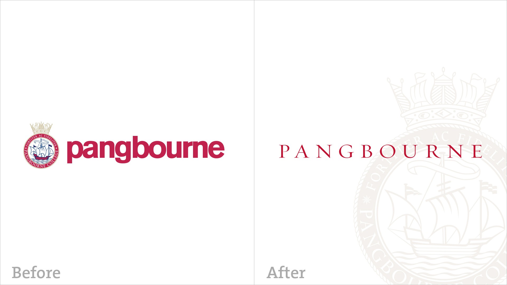
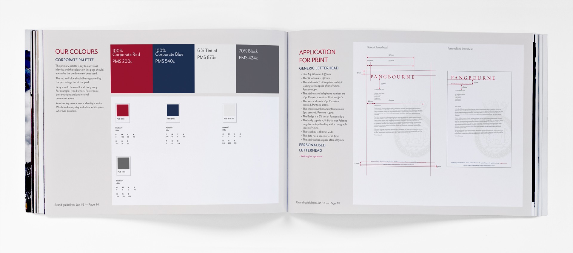
“We need to refresh our brand whilst still retaining the traditional elements that reflect our culture and ethos. Is it possible to convey a sharper, more contemporary image without losing gravitas, projecting an understated, professional feel? Currently there are issues regarding application and consistency so we definitely need comprehensive brand guidelines.”
Direction
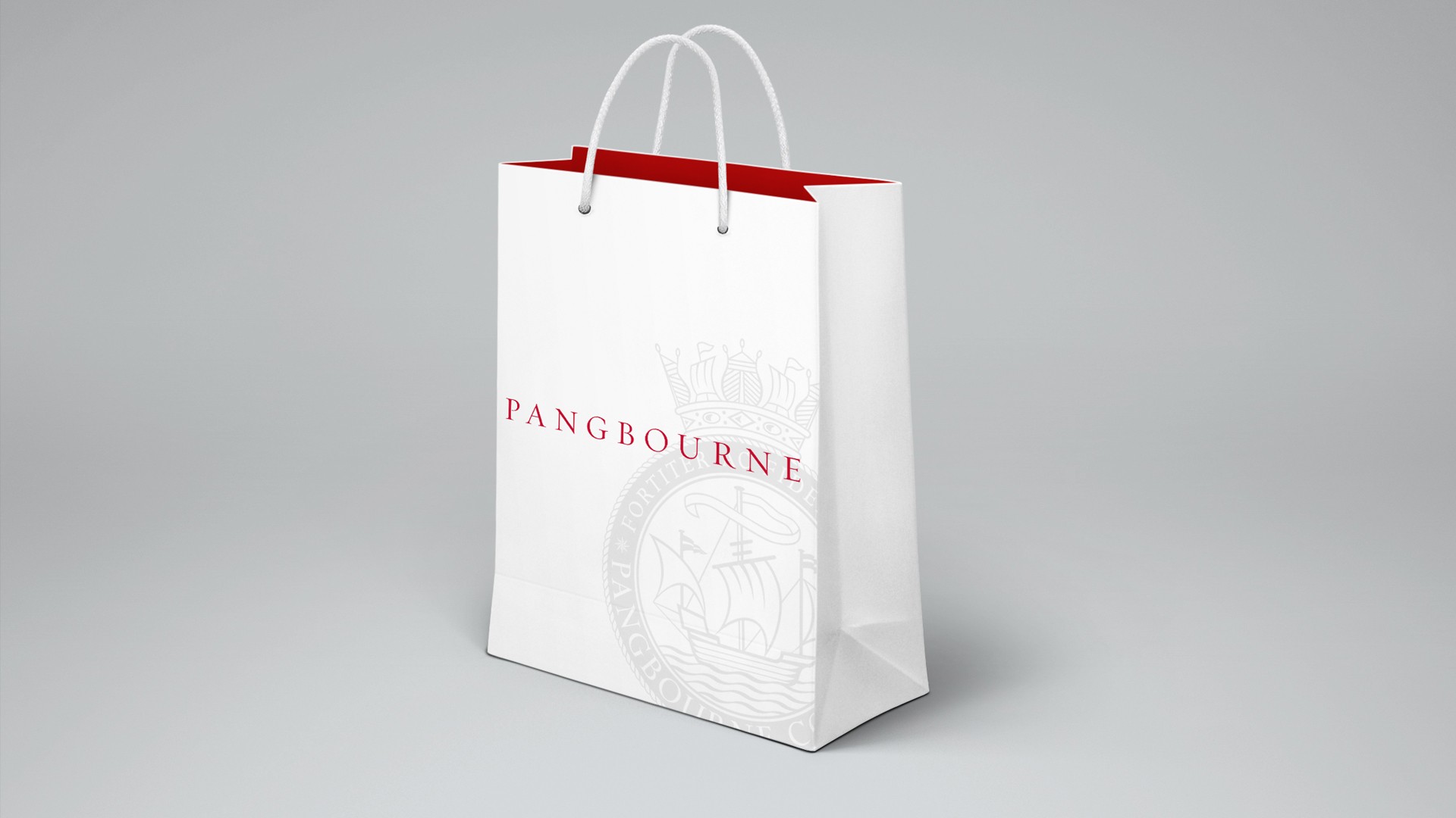
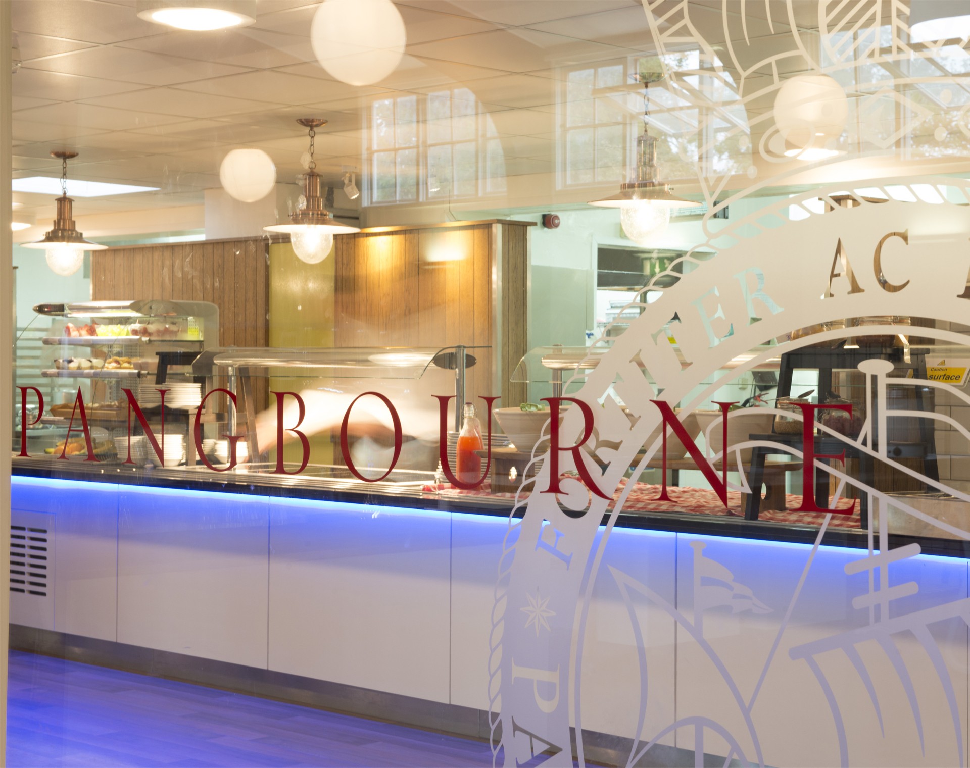
Sometimes the best thing to do with elements that reflect heritage and tradition is to leave them well alone. Whilst the rather jaunty Pangbourne crest was a little out of sorts with the positioning and values of College, treated in a more subtle, elegant way, it was absolutely right. Combined with a beautiful, confident font, reproduced predominantly in red, the perfect balance was achieved.
