State school re brand
“As we begin to roll out our new image, feedback from staff, parents and students has been overwhelmingly positive. Each step of the way, from our initial meeting to helping us present the final branding to school governors, Paul and Emma have been outstanding.”
Brief
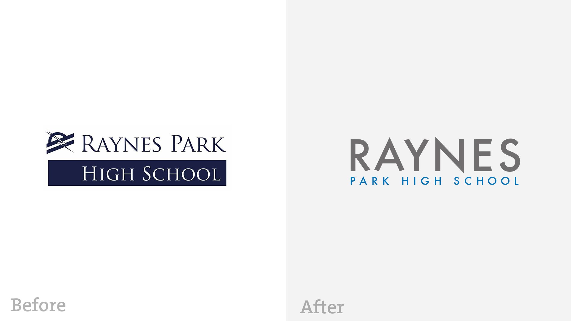
The current logo, created when the school was established, was designed to reflect its location – a visual representation of the road and proximity to an electrified railway line. As such, while well established and recognised, it was never intended to capture the ethos and values of the school, which in any case have subsequently evolved. We were invited by Raynes Park High School to develop a new look and feel, communicating a consistent, cohesive, compelling brand message.
Direction
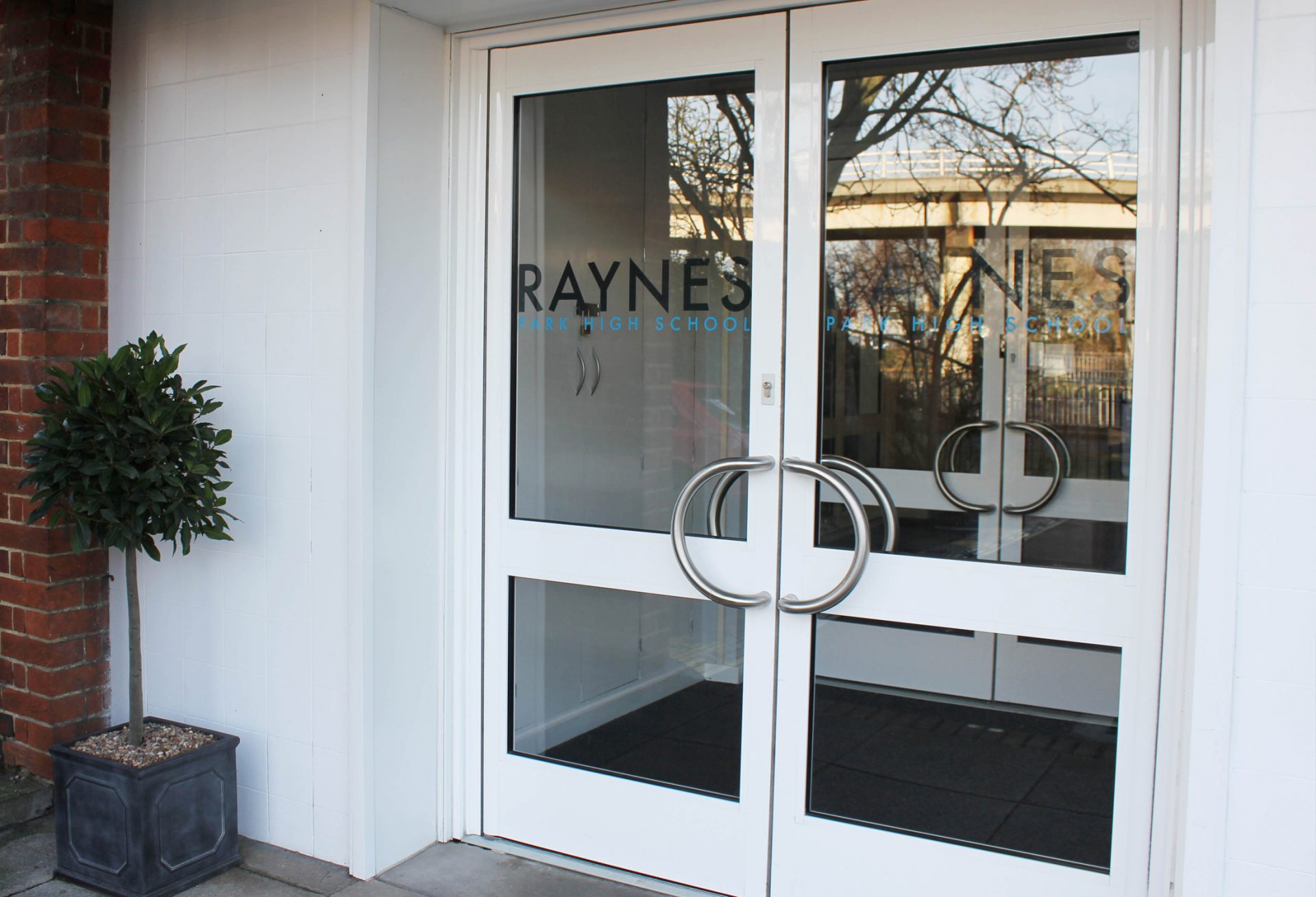
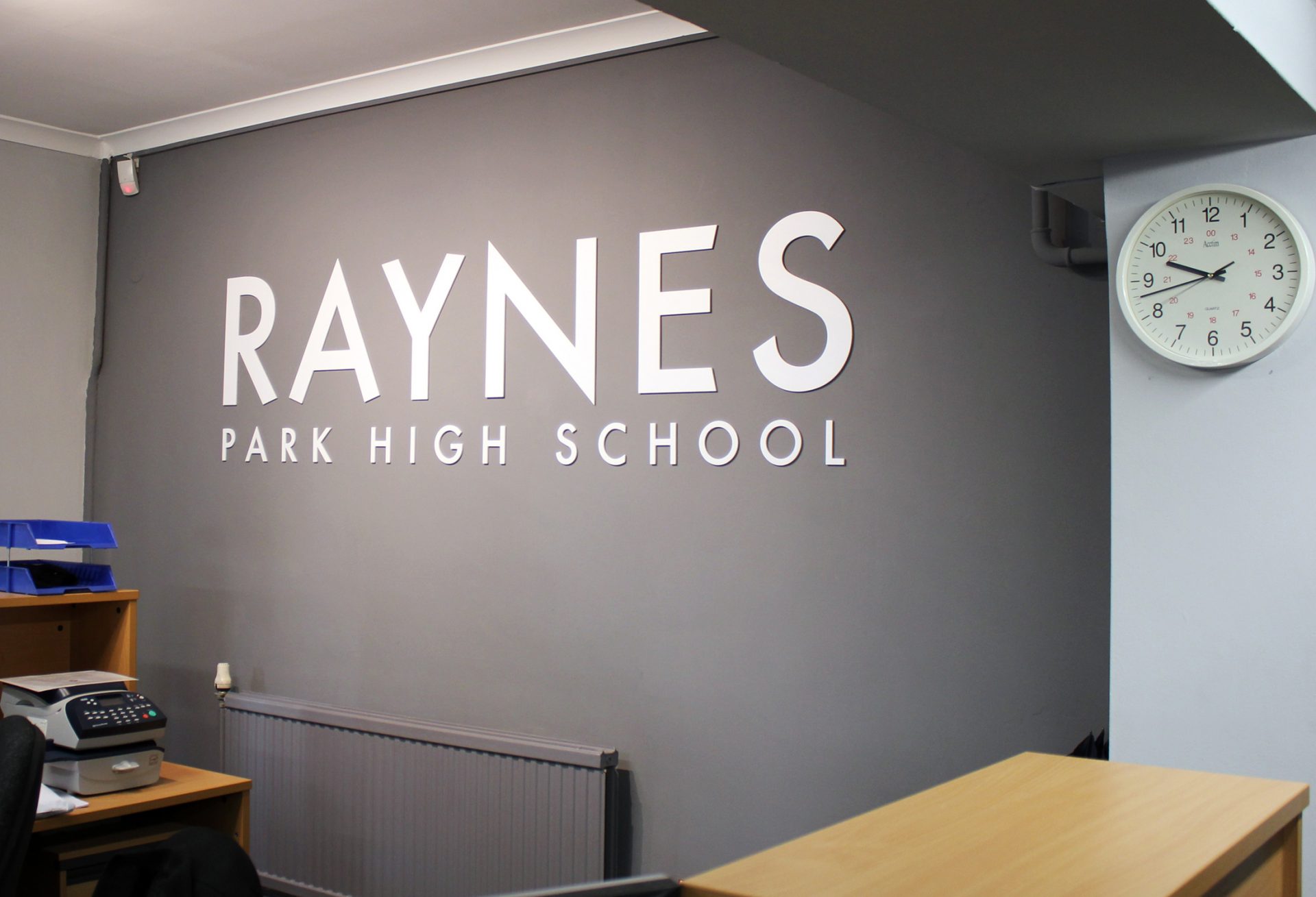
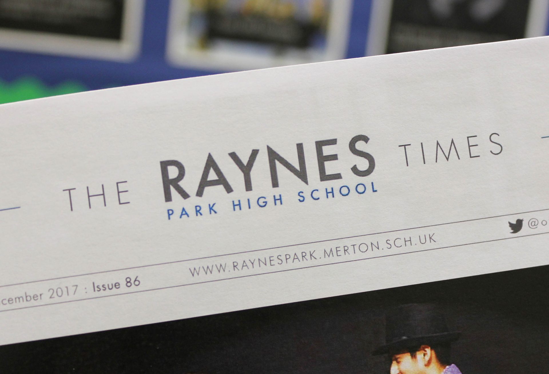
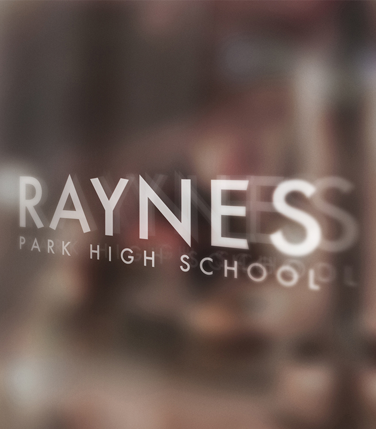
The new Raynes Park logotype is reflective of the heritage of the school, inspired by 1930s typography, yet also crisp, clean and contemporary. The emphasis is on Raynes projecting a more forward looking, dynamic, vibrant message. It is fresh and distinctive, without fundamentally changing the name of the school. As a nod to the old logo, the flash shape is also echoed in the N of Raynes. This has informed the prospectus, website, advertising and other marketing and communication material.
“We are incredibly grateful for the brilliant work which Kilvington has done for Raynes Park High School. Upon hearing Paul’s ideas, it became abundantly clear that he had really listened to all we had spoken about, managing to reflect both our school’s history and plans for the future. As we begin to roll out our new image, feedback from staff, parents and students has been overwhelmingly positive. Each step of the way, from our initial meeting to helping us present the final branding to school governors, Paul and Emma have been outstanding.”
Rachel Burnham, Marketing & Communications
